
1. Understanding Focal Points in Garden Design
When you walk into a well-designed garden, your eyes are naturally drawn to certain spots—maybe its a vibrant red maple, a classic fountain, or a colorful flower bed. These are called focal points, and they play a key role in landscape design. A focal point helps organize the space, adds visual interest, and guides the viewer’s eye through the garden.
What Is a Focal Point?
A focal point is any feature in your garden that stands out and draws attention. It can be natural, like a tree or large boulder, or man-made, such as a sculpture or bench. The goal is to anchor the design and give the viewer something to focus on as they move through the space.
Why Focal Points Matter
Without focal points, a garden can feel flat or overwhelming. Strategic placement of focal elements helps create balance and flow. Here’s how focal points enhance your landscape:
| Benefit | Description |
|---|---|
| Visual Interest | Adds excitement and uniqueness to your garden. |
| Sense of Direction | Guides visitors through pathways or spaces with intention. |
| Balance & Structure | Organizes plants and features around a central theme. |
| Personal Expression | Reflects your style or tells a story through design. |
How Focal Points Guide the Eye
The human eye naturally looks for contrast—something that stands out from its surroundings. You can use this to your advantage by placing bold colors, unique textures, or standout shapes at strategic locations in your yard. This technique not only highlights beautiful features but also draws people deeper into the space.
Examples of Effective Focal Points
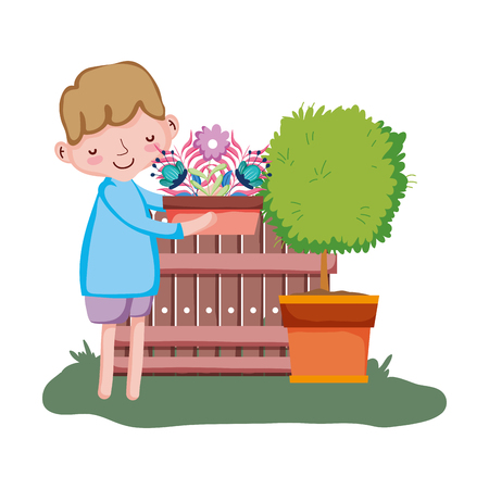
- A bright ceramic pot filled with annuals at the end of a walkway
- An ornamental tree framed by lower shrubs and perennials
- A birdbath surrounded by soft-colored groundcovers
- A painted bench under an arbor draped with vines
Quick Tip:
Use odd numbers when grouping plants around focal points—it feels more natural to the eye and keeps things from looking too symmetrical or staged.
By understanding how focal points work in garden design, youre laying the foundation for creating a landscape thats both inviting and visually impactful.
2. Color Theory Basics for Outdoor Spaces
Understanding a few basic principles of color theory can make a big difference when designing your outdoor space. By using color intentionally, you can draw the eye to focal points, create mood, and add visual interest throughout your landscape.
Warm vs. Cool Tones
Colors are generally divided into two main categories: warm tones and cool tones. Each has its own effect on how a space feels and how the eye moves through it.
| Warm Tones | Cool Tones |
|---|---|
| Red, orange, yellow | Blue, green, purple |
| Feel energizing and bold | Feel calming and soothing |
| Advance visually (appear closer) | Recede visually (appear farther away) |
Use warm colors to highlight areas you want to stand out — like an entryway or a feature plant. Cool colors are great for creating depth or making a small yard feel larger.
Complementary Colors
Complementary colors sit opposite each other on the color wheel — like red and green or blue and orange. When used together, they create strong contrast and make each other pop.
This is especially useful in garden design. For example:
- Purple flowers against yellow foliage
- Blue planters near orange marigolds
- Red blooms beside plants with green leaves
The goal isn’t to overwhelm with too much contrast, but to use it strategically so that key features get noticed.
Applying Color Theory to Plants and Hardscape Materials
You can apply these principles not only through flower selection but also with foliage, containers, mulch, pavers, fences, and furniture. Here’s how:
| Element | Color Impact Tips |
|---|---|
| Plants (flowers & foliage) | Choose blooms by seasonal color; combine warm and cool tones for balance; layer foliage textures for added interest. |
| Pots & Planters | Select colors that contrast with plantings or echo home exterior shades for harmony. |
| Paving & Stonework | Use neutral tones to ground bold planting schemes; or choose colored concrete to enhance focal points. |
| Fencing & Walls | Darker colors recede and help plants stand out; lighter colors brighten shady corners. |
A thoughtful mix of warm and cool tones, along with smart use of complementary colors, helps define focal points naturally and brings your entire outdoor design together.
3. Strategic Color Placement for Maximum Impact
Creating strong focal points in your garden doesn’t just depend on choosing the right colors—it’s all about where and how you use them. Bold color placement can guide the eye, highlight key areas, and bring balance to your landscape design. By using techniques tailored to American garden styles—from cottage gardens in the Northeast to xeriscapes in the Southwest—you can make a lasting impression with strategic color.
Understanding Focal Zones
Before placing bold colors, identify your garden’s focal zones. These are areas where you want to draw attention—like entryways, seating areas, or special features such as fountains or sculptures. Use vibrant flowers or foliage around these spots to naturally pull the eye toward them.
High-Impact Color Placement Techniques
Here are some simple techniques that work well across different U.S. regions:
| Technique | Description | Best For |
|---|---|---|
| Color Blocking | Group bold-colored plants together in one area for a dramatic effect. | Modern or structured gardens |
| Accent Planting | Add pops of bright color among neutral tones to highlight specific plants or features. | Cottage-style or naturalistic gardens |
| Seasonal Rotation | Switch out bold annuals by season to keep focal points fresh and eye-catching year-round. | Four-season climates (e.g., Midwest, Northeast) |
| Framing Views | Use vibrant plants on either side of a path or gate to frame a view and guide movement. | Entryways and walkways |
| Contrasting Backdrops | Place bright blooms in front of dark foliage or walls to make them stand out more. | Tropical or urban gardens |
Regional Considerations for Color Placement
Your local climate and garden style also play a role in how effective your color choices will be. For example:
- Southeast: Use bold tropical hues like red hibiscus or orange cannas around patios for a lush vibe.
- Southwest: Pair warm-colored succulents with gravel paths for contrast and heat tolerance.
- Northeast: Highlight seasonal changes by planting tulips in spring and chrysanthemums in fall near entrances.
- Pacific Northwest: Brighten shady areas with gold hostas or fuchsia impatiens to create visual interest despite low light.
- Midwest: Use perennial borders with strong summer bloomers like coneflowers and black-eyed Susans for long-lasting impact.
Create Visual Flow with Repetition and Rhythm
If youre working with a larger space, repeat bold colors at intervals along paths or garden beds. This creates rhythm, helping guide visitors through your landscape while reinforcing your focal areas. Just be careful not to overdo it—too many bold spots can compete for attention rather than support one another.
A Quick Tip:
A good rule of thumb is to use bold colors in 20% of your garden space while keeping the remaining 80% more neutral. This way, your statement plants truly stand out without overwhelming the senses.
4. Balancing Boldness and Subtlety
Creating visual impact in your garden isn’t just about using bright, bold colors everywhere—it’s about knowing how to balance those vibrant hues with softer, more muted tones. This contrast helps you highlight focal points without overwhelming the space.
Why Balance Matters
When everything in a garden is bold and saturated, nothing truly stands out. Your eye doesn’t know where to rest. That’s why pairing vivid flowers or foliage with neutral or calm-toned plants helps create a more intentional and relaxing design.
Tips for Mixing Vibrant and Muted Colors
- Use bold colors sparingly: Treat them like accents—think of them as exclamation points in your landscape.
- Surround bright plants with calming companions: Soft greens, silvers, or dusty blues help tone down the intensity.
- Create rhythm: Repeat subtle colors throughout the garden to unify different areas, then sprinkle in pops of color for interest.
Suggested Color Combinations
Here are some ideas to get you started with balancing bold and subtle tones:
| Bold Color | Muted Companion | Effect |
|---|---|---|
| Bright Red (e.g., Geranium) | Sage Green (e.g., Lambs Ear) | Creates drama while keeping the look soft |
| Deep Purple (e.g., Salvia) | Dusty Lavender (e.g., Russian Sage) | Adds depth without being too loud |
| Golden Yellow (e.g., Coreopsis) | Soft Gray (e.g., Artemisia) | Makes yellow pop while staying grounded |
Think in Layers
You can also balance color by layering. Use muted tones as a base layer—these might be groundcovers or background shrubs—and place brighter plants at focal points, like near an entryway, patio, or garden sculpture. This creates dimension and helps direct attention exactly where you want it.
A Little Goes a Long Way
If youre unsure how much bold color to use, start small. A container with vibrant blooms or a single colorful shrub can make a big statement when surrounded by subtle greenery. Over time, you’ll develop an eye for how much contrast your space can handle.
Pro Tip:
If you’re working with limited space, such as a front yard border or small patio garden, stick to two or three main colors—one bold and one or two soft—to keep things cohesive and visually balanced.
5. Practical Tips and Plant Pairings
Creating a visually stunning garden starts with choosing the right colors and placing focal points where theyll have the most impact. Whether youre gardening in the humid Southeast, dry Southwest, or temperate Pacific Northwest, knowing what works best for your region can make all the difference. Here are some practical tips and plant pairings tailored to U.S. climate zones and design preferences.
Color Combinations That Work
Use contrasting colors to draw attention, or analogous colors for a more harmonious feel. Heres a quick reference guide:
| Color Scheme | Description | Example Plant Pairings |
|---|---|---|
| Complementary | Colors opposite on the color wheel; high contrast | Purple Salvia + Yellow Coreopsis |
| Analogous | Colors next to each other on the color wheel; soothing look | Red Zinnias + Orange Marigolds + Yellow Rudbeckia |
| Monochromatic | Shades of one color; elegant and cohesive | Pale Pink Roses + Deep Pink Peonies + Light Pink Cosmos |
Focal Point Placement Tips
- Corners and Entryways: Place bold plants or garden art to guide the eye and define space.
- Borders and Beds: Use tall, colorful plants as vertical interest at the back or center.
- Circular Spaces: Anchor with a dramatic specimen plant or water feature in the middle.
Plant Choices by Climate Zone
Selecting plants that thrive in your zone ensures year-round beauty. Heres a breakdown by major U.S. regions:
| Region | Zoning Guide (USDA) | Ideal Focal Plants | Seasonal Color Suggestions |
|---|---|---|---|
| Northeast | Zones 4–7 | Dwarf Hydrangea, Coneflower, Japanese Maple | Tulips in spring, Mums in fall |
| Southeast | Zones 7–9 | Crape Myrtle, Gardenia, Camellia | Zinnias in summer, Pansies in winter |
| Midwest | Zones 4–6 | Coneflower, Black-Eyed Susan, Ornamental Grasses | Daffodils in spring, Asters in fall |
| Pacific Northwest | Zones 6–8 | Acer palmatum (Japanese Maple), Rhododendrons, Ferns | Crocus in early spring, Dahlias in summer |
| Southwest & West Coast | Zones 8–10+ | Lantana, Agave, Bougainvillea | Lavender in spring/summer, Succulents year-round |
A Few More Quick Tips:
- If youre working with small spaces like urban patios or balconies, use container gardens with bold colors to create mini focal points.
- Add lighting near focal points to make them pop at night—solar spotlights work great and are energy efficient.
- Avoid overcrowding—give your star plants room to shine!
The key is balance: mix textures, vary heights, and keep seasonality in mind so your garden maintains visual interest all year long.